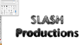
This is the text I started with, the font I chose for this I felt was clear and precise and also allowed me to edit the text well. The first step I took in the editing process was to add some slash marks around the text, by downloading a slash tool brush preset I had access to many different shapes and patterns in the brush selection. The slasher marks I believe dont just look effective and cutting edge but they also fit the generic conventions of both genre and production logos.

I created a new layer and named it 'texture', this would be the layer in which i created by blood background.

I was able to achieve this really detailed looking blood splat effect by downloading a splatter brush set and going through the same steps as before. In order to maximise the blood splats on the screen I increased the size of the brush that I was using. Also on my layer panel I pulled the texture layer to the bottom so the blood splats would not overlay the text.

On the text layer i then selected a soft brush and changed the colour to white, increased the size of my brush and randomly made so marks over the current production logo's text. I then selected the layer style and chose overlay. I also added a picture of slash marks which i feathered to fit the text.

The effect if the previous step is seen in this screenshot as the white blotches have been overlayed and are only recognizable within the text and it makes the whole production logo have a much greater effect.

I then double clicked the text layer to access the blending options. I applied the following edits to the actual text; Drop Shadow, Inner Shadow, Inner Glow, Bevel and Emboss, Gradient Overlay and Stroke. All of these various options allowed me to create an effective looking text but the Bevel and Emboss option made the significant outline which makes my text stand out from the rest of the logo.

After merging all my existing layers into one I duplicated my whole logo to make a copy, once I had my copy layer I then choose the Smart Sharpen effect, this allowed me to control the sharpness of the logo and furthermore making it stand out.

I then repeated a similar stage to the white blotches by selecting a large soft brush, once I done this I began making marks on the text in colors which I felt were appropriate to my audiences needs and also fitted genre conventions.

Then once I applied the orange and red blotches I selected the color layer style. This I believe gave the text a great appearance as it brought something unique to the text with a combination of suitable colours.

I then selected a new adjustment layer and selected curves, the curves indicators allow me to darken, lighten and emphasize any colours that have the potential to look really effectives.

I wanted to take the production logo further in terms of the colour, so I decided to add another adjustment layer.

This colour balance allowed me to focus allot more on what colours I wished to enhance/dehance. With this available my attention was to add emphasis to the red section of the indicators. I chose to put the red midtones to 100.

This is the final production logo, but I was not quite satisfyed with the final result therefore I decided to add a background which you can see in the final screenshot.

This final screenshot shows my finished logo and I believe the editing stages were very succesful for me and i have a great result. The logo I believe strongly supports horror and slasher horror conventions therefore it is said that my target audience gratifications will infact be met.
Excellent demonstration of the practical production process and use of ICT.
ReplyDelete