Wednesday, 29 February 2012

Film Editing Research


Film editing involves combining shots into sequences, film editing does need practice and it can become difficult when working with the film essentials; images, story, dialogue, music and pacing. The aim is to create a good cohesion for the final product; many different film essentials have their own meaning, for instance music is used in trailers in order to enhance mood and reinforce the message that is trying to be shown, if I do this then I can hopefully convey the mood of fear and anxiety. By achieving an effective production you are more likely to satisfy the gratifications of your audience. With editing it can soon become and experiment and by practicing you can bring out an actors performance and create a point of view, which is suitable to the production.

A key word and one particular word stands out in film editing terminology and that’s ‘continuity’ this is what I want to achieve as an editor. The term involves a series of shot appearing ‘physically continuous’ and by editing my footage I can make this possible.

Montage which comes from the French for ‘putting together’, this is another film editing technique similar to continuity. Lev Kuelshov (1920’s) described editing similar to making a building, “Brick by brick (shot-by-shot) the building (film) is erected”. The success of montage is down to the viewers inferring meaning based on context.

Like many media techniques there are theories around them and film editing is no different:

Edward Dmytryk- suggests a good editor should follow ‘Rules of cutting’

"Rule 1: Never make a cut without a positive reason."
"Rule 2: When undecided about the exact frame to cut on, cut long rather than short."
"Rule 3: Whenever possible cut 'in movement'."
"Rule 4: The 'fresh' is preferable to the 'stale'."
"Rule 5: All scenes should begin and end with continuing action."
"Rule 6: Cut for proper values rather than proper 'matches'."
"Rule 7: Substance first—then form."

Walter Murch- when editing there is a main criteria made of six evaluative comments to decide where to cut. I have chosen to select 3 of the 6 criteria, which I believe are relevant to my production.

Emotion (51%) -Does the cut reflect what the editor believes the audience should be feeling at that moment?
Story (23%) - Does the cut advance the story?
Rhythm (10%) - Does the cut occur "at a moment that is rhythmically interesting and 'right'"?
Tuesday, 28 February 2012

My Production Logo

Here is the step by step process that i went through in order to produce my very own Production Logo.


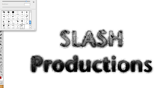
This is the text I started with, the font I chose for this I felt was clear and precise and also allowed me to edit the text well. The first step I took in the editing process was to add some slash marks around the text, by downloading a slash tool brush preset I had access to many different shapes and patterns in the brush selection.  The slasher marks I believe dont just look effective and cutting edge but they also fit the generic conventions of both genre and production logos.


I created a new layer and named it 'texture', this would be the layer in which i created by blood background.

I was able to achieve this really detailed looking blood splat effect by downloading a splatter brush set and going through the same steps as before. In order to maximise the blood splats on the screen I increased the size of the brush that I was using. Also on my layer panel I pulled the texture layer to the bottom so the blood splats would not overlay the text.


On the text layer i then selected a soft brush and changed the colour to white, increased the size of my brush and randomly made so marks over the current production logo's text. I then selected the layer style and chose overlay. I also added a picture of slash marks which i feathered to fit the text.

The effect if the previous step is seen in this screenshot as the white blotches have been overlayed and are only recognizable within the text and it makes the whole production logo have a much greater effect.


I then double clicked the text layer to access the blending options. I applied the following edits to the actual text; Drop Shadow, Inner Shadow, Inner Glow, Bevel and Emboss, Gradient Overlay and Stroke. All of these various options allowed me to create an effective looking text but the Bevel and Emboss option made the significant outline which makes my text stand out from the rest of the logo.

After merging all my existing layers into one I duplicated my whole logo to make a copy, once I had my copy layer I then choose the Smart Sharpen effect, this allowed me to control the sharpness of the logo and furthermore making it stand out.


I then repeated a similar stage to the white blotches by selecting a large soft brush, once I done this I began making marks on the text in colors which I felt were appropriate to my audiences needs and also fitted genre conventions.


Then once I applied the orange and red blotches I selected the color layer style. This I believe gave the text a great appearance as it brought something unique to the text with a combination of suitable colours.

I then selected a new adjustment layer and selected curves, the curves indicators allow me to darken, lighten and emphasize any colours that have the potential to look really effectives.


I wanted to take the production logo further in terms of the colour, so I decided to add another adjustment layer.

This colour balance allowed me to focus allot more on what colours I wished to enhance/dehance. With this available my attention was to add emphasis to the red section of the indicators. I chose to put the red midtones to 100.


This is the final production logo, but I was not quite satisfyed with the final result therefore I decided to add a background which you can see in the final screenshot.


This final screenshot shows my finished logo and I believe the editing stages were very succesful for me and i have a great result. The logo I believe strongly supports horror and slasher horror conventions therefore it is said that my target audience gratifications will infact be met. 

Existing Production Logo's

I have chosen to look at existing production logos in order to better my understanding of conventions within my genre, the horror genre use many production companies but the ones I have chosen to focus on are the outstanding 'Horror' production companies.


This is Lionsgate logo, this production company use generic conventions and connotations of Horror such as the smokey red background for good effect. The solid silver lettering is also bold and the text looks as if it has been edited to give a cold metal look. The dark edges of the logo is one of my favourite features of this logo because it centres the focus towards the text. 


Hammer films is a more old style production company which is more common through the 60's 70's era, but its still useful to analyse from a range of past, present and future sources. The text for this logo has strong connotations of gothic horror text because of the precise lettering used. Again the logo chooses to use black and red colours which both connote blood and horror.


Twisted pictures is the final production logo I will look at, the logo is animated on screen and the barbed wire is a great visual effect to observe and take inspiration from. Looking at the production logo it has given me ideas to look at having an animated production logo. The dark and grey colours are all used to again connote evilness

Production Blog Update

Critical Response from my filming for my product 'The Proprietor'.

Monday, 27 February 2012

Costume: Rick Strangle (The Proprietor)

This is my antagonists costume that I made to suit the deep dark villain character he is playing in my production, I achieved the results shown below by burning areas of the T-Shirt and jeans to help the audiences understanding of what has happened to the character, and also I have torn parts of the material and rubbed mud into the cloth to give it a realistic and effective look. 


Location: Rocky Valley Woods

See Photobucket profile for pictures of the location for 'The Proprietor'.


http://s1159.photobucket.com/albums/p638/rundle9/

Wednesday, 1 February 2012

Existing Shots: CSI

This CSI edits talk is a really interesting resource for when I begin filming my trailer product, when looking at It I focused particularly on a segment which used green screening in order to create an excellent scene using a hatchet similar to my plans for my trailer. I think it would be interesting to look into using this technique but with different lighting in a studio including strobe lighting.

The screenshots below are from the scene that I viewed.


The images show a brief process in how to make the scene come to life, creating something using green screen and allowing myself to create common conventions of the slasher horror will really benefit the audience and myself. Although this shot I plan is not incorporated into my script and shot list I understand that their will be variables in the production and I will include a storyboard sketch for the shot.