The purpose of the film poster is to initially launch the advertisement of a film, this is done by using a compilation of different images and text which explains the film in the best possible way and the most attractive way for its target market. Prior to the 1990's this was done through the use of illustrations. I think like other promotionial material Andrew Wernick's 'Vortex theory' is very applicable to film posters, he coins on the way promotional material feeds back into audiences and back onto itself, for example the Saw film poster advertisement promotes the current film and the other films it has released, also any other Saw promotion's i.e. the ride in Thorpe Park or its distribution company. I believe somewhere along the lines all film posters use this theory to promote itself.
 SAW IV poster analysis.
 SAW IV poster analysis.
The denotation of this image looks very bland and the one and only iconic image takes up a large spread of the poster, apart from the title and tag line the image dominates the poster and acts as a aesthetic trigger to the audience, which applies to other Saw film posters as the producers like to let the audience establish their own views.
The tagline for the poster is endorsing its own image by saying ‘if it’s Halloween it must be...,’ again they use promotional techniques from the previous films, not only do they set yet another Halloween release when audiences search for a typical ‘saw’ film. They’re putting emphasis on the release date, as very few films get the opportunity to release on such a vital date when the genre dominates the box office. So if its own, then you know it’s done something worthy of receiving its place.
The denotation of the posters colour scheme is very basic only using greys, white and black. The connotation however express’s coldness and fear. Part of the image which is the metal also connotes discomfort.
The character’s condition can be obviously associated as dead but an enigma is created for new viewers as they would be eager to know how the character became the state he is in.
The connotation of the character image show’s he was old, very frail and had some form of head injury which affected his death dramatically.
The image like most horror film posters creates some sort of juxtaposed opinion for viewers, as they automatically assume that the film is about death and torture with what looks like unofficial operational equipment.
The typography of the writing very much so connotes the genre of the film being big bold and dark.
Another technique used to promote the power of the image is that it overlaps the text making it positively more iconic than the text.
In a matter of personal opinion the target audience seems to be males and of course people who have watched the previous films.

Dark Knight poster analysis.
The tagline instantly suggests that this film has some crime and within Gotham City and rules is broke; therefore the iconic image ‘Batman’ IS the solution.
The iconic image is framed from a low angle shot which promotes power to Batman as he is looking down on the audience. The costume design also upholds his authority status by showing detail on muscle.
The DC symbol on the bottom part of the poster associates batman as part of the DC comic collection therefore fans of that comic book production will be open to watching the film.
The trademark brand image is recognized by a wide range of audience and is used in a multiple aspect not only over the title layout but also it is on fire above Batman’s head which is unusual as fire is represented as evil.
The smoke follows superhero genetic codes and conventions by connoting his image as mysterious.
Unlike other movie posters this poster shows allot of information and has a lot going on which is a contrasting technique to revealing little. Some movie fans prefer this because they know what they’re going to get with a poster like this.
The cast list is placed below the main iconic image with the surname in an increased font size because the surnames are big Hollywood names; Heath Ledger is a well recognized actor and a very important part in the film, Christian Bale is identifiable for Batman’s role and Morgan Freeman is one of the most recognizable actors of all time. All of these talents are a subliminal technique of drawing in fans.
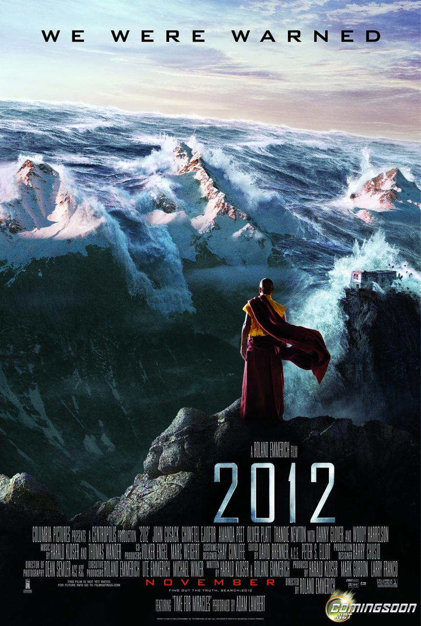
2012 poster analysis.
This poster has an out looking perspective for people viewing it, the tagline contrasts against the colourful skyline to highlight emphasis on it as this acts as the main feature.
This poster takes great stead with the uses and gratifications theory, it tries to give an impression of what the media can do for its audience (Katz 1959) by adressing the audience and allowing them to take away a message which leaves an ultimate gratification.
The mise en scene is very powerful in this poster as it contributes a vital part to the iconic image which is a monk standing on the Himalayas, so with the denotation of a wave matching the height of such a big mountain it gives the audience an element of fear when looking at the connotation of the world coming to an end.
The mise en scene is very powerful in this poster as it contributes a vital part to the iconic image which is a monk standing on the Himalayas, so with the denotation of a wave matching the height of such a big mountain it gives the audience an element of fear when looking at the connotation of the world coming to an end.
The typography of the tagline is in a capitalized standard which is bold and draws further attention. The typography of the ‘2012’ is a grey and dark colour scheme which stands out to the audience and looks like a modern silver chrome lettering.
The ‘November’ teaser release date is in red, a colour that symbolizes fear and death.
Amongst the detail in this poster the CGI effects for this poster is more than noticeable, the explicit effects of the waves clashing with the mountains is an amazing development in cinema production and audiences notice this.
The purpose of this film is to intrigue the reader and make them question the significance of the year ‘2012’.
The target audience for this film is near enough everyone because the plot is based on a possible factual circumstance.
Greg, your time management is good/excellent - you are obviously working hard on your research. Your analysis of posters is good (you are using media terminology with confidence and contemplating the connotations), however, I would like to see a more analysis of target audience (e.g. link the Brit film theory/critics you studied last year into your blog to demonstrate your understanding of gratification theory etc). Also, link what you observe (in terms of common conventions and style) to your own work (e.g. what you like/dislike and how this may influence your own practice/productions).
ReplyDelete